Design system & rebuild of a mental health platform
In preparation for PlaySpace's market launch, the product, design and dev team was tasked with rebuilding the platform from the ground up. As the sole product designer, I re-designed the platform, updated the information architecture, fixed core UX issues, and refreshed the visual language.
ROLE
Product Designer
TEAM
2 Product Managers
3 Developers
1 QA
3 Clinical Advisors
DURATION
2 months
SKILLS
Design Systems
Figma Variables
UI/UX
User Research
Prototyping
Impact
20 pages and 18 features redesigned
6 pages and 19 features introduced
Refreshed visual language
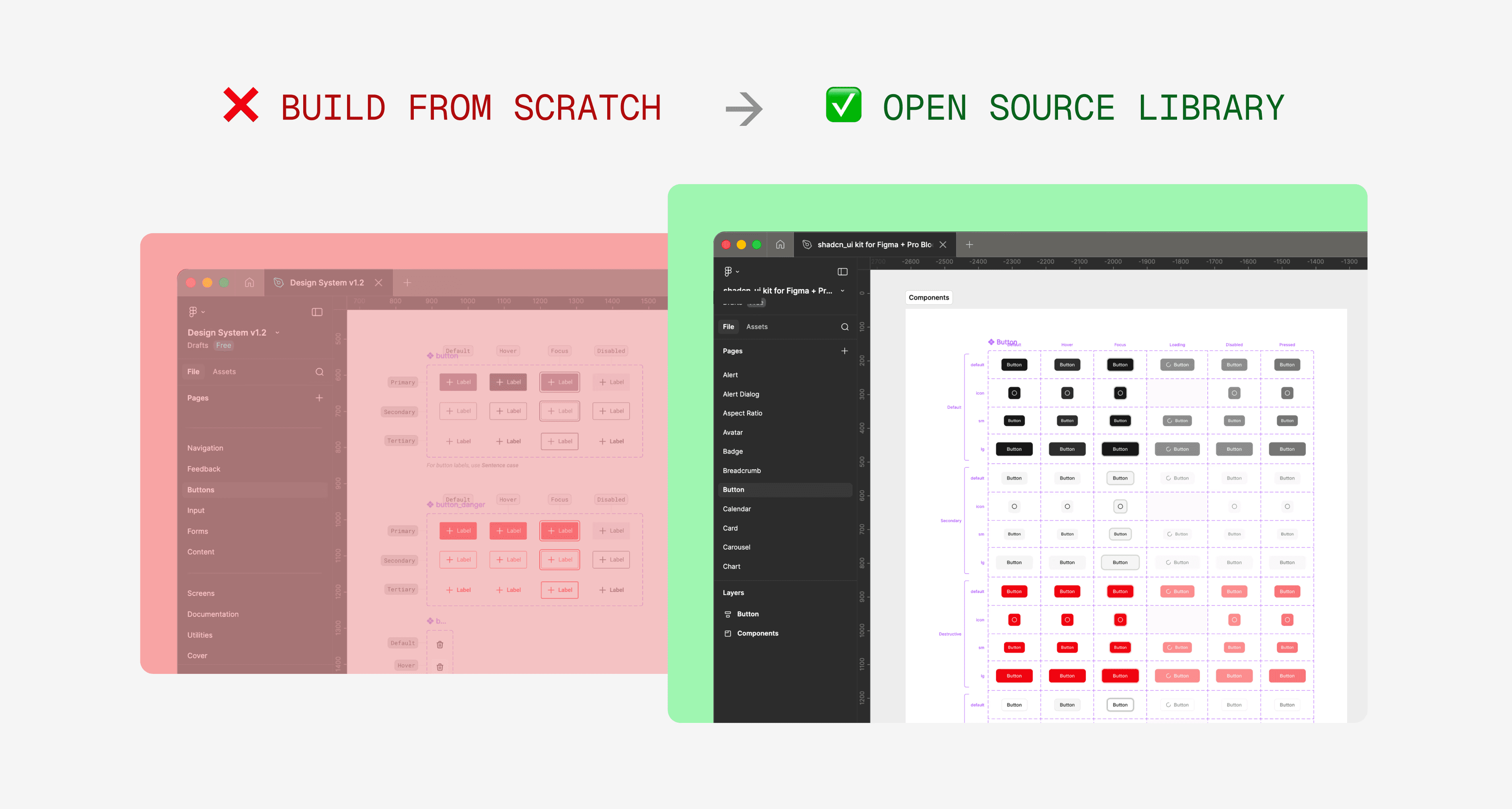
Lack of design foundation
The existing tech stack was built on hard-coded styles, an incomplete component library, and a visual language that didn't match the broader brand identity — creating a disconnected user experience and unscalable system.
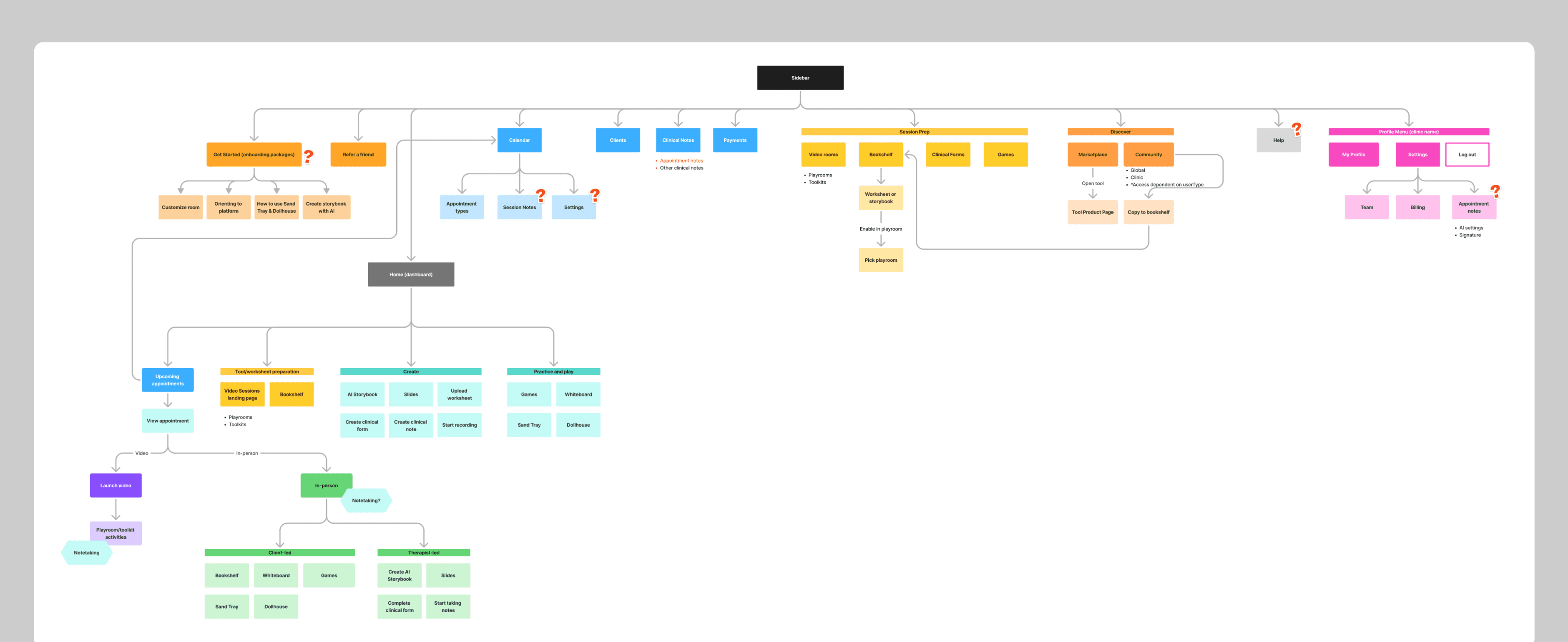
Unclear information architecture
Navigation and organization made existing features hard to discover, while we simultaneously had to account for new features being added without a clear roadmap.
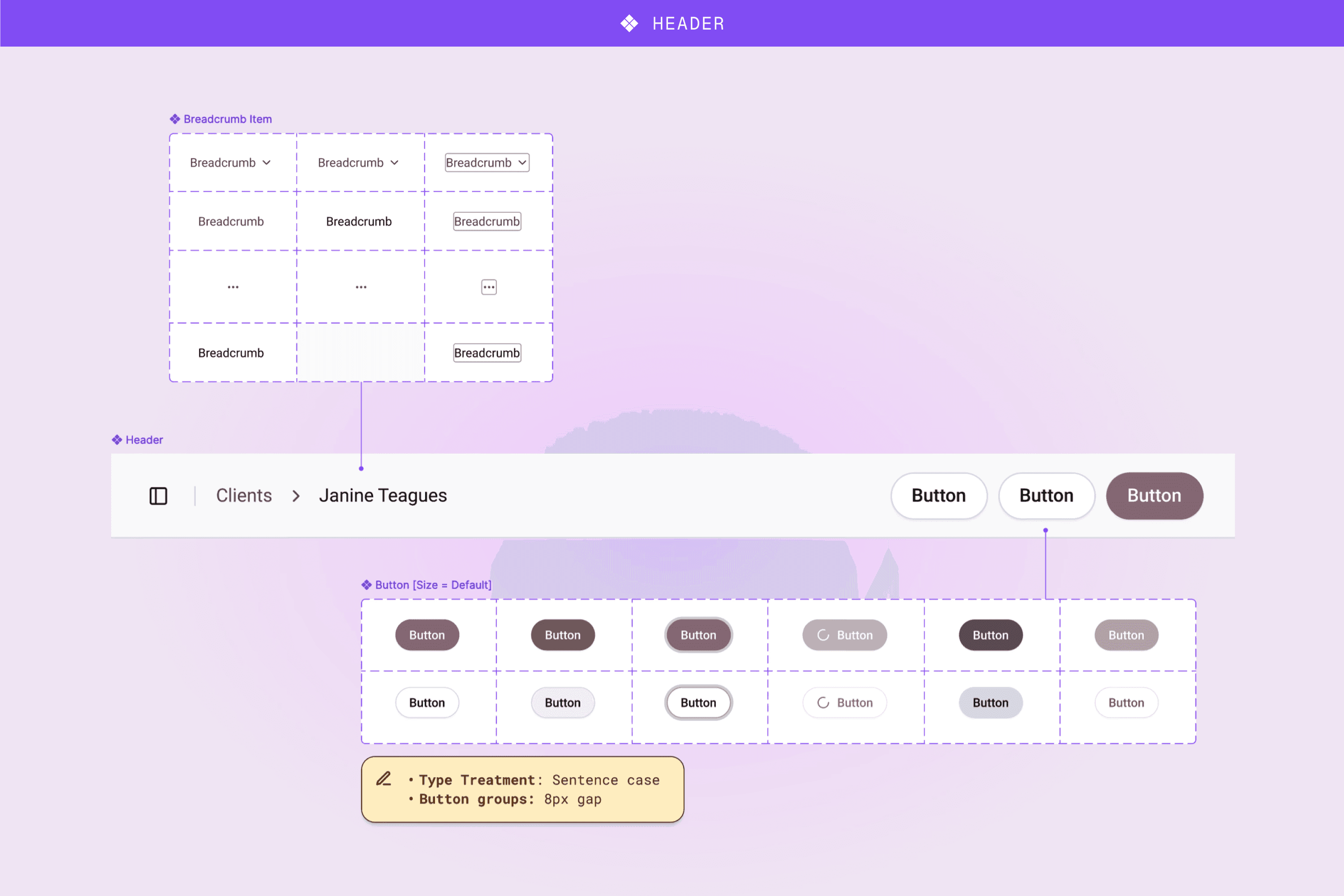
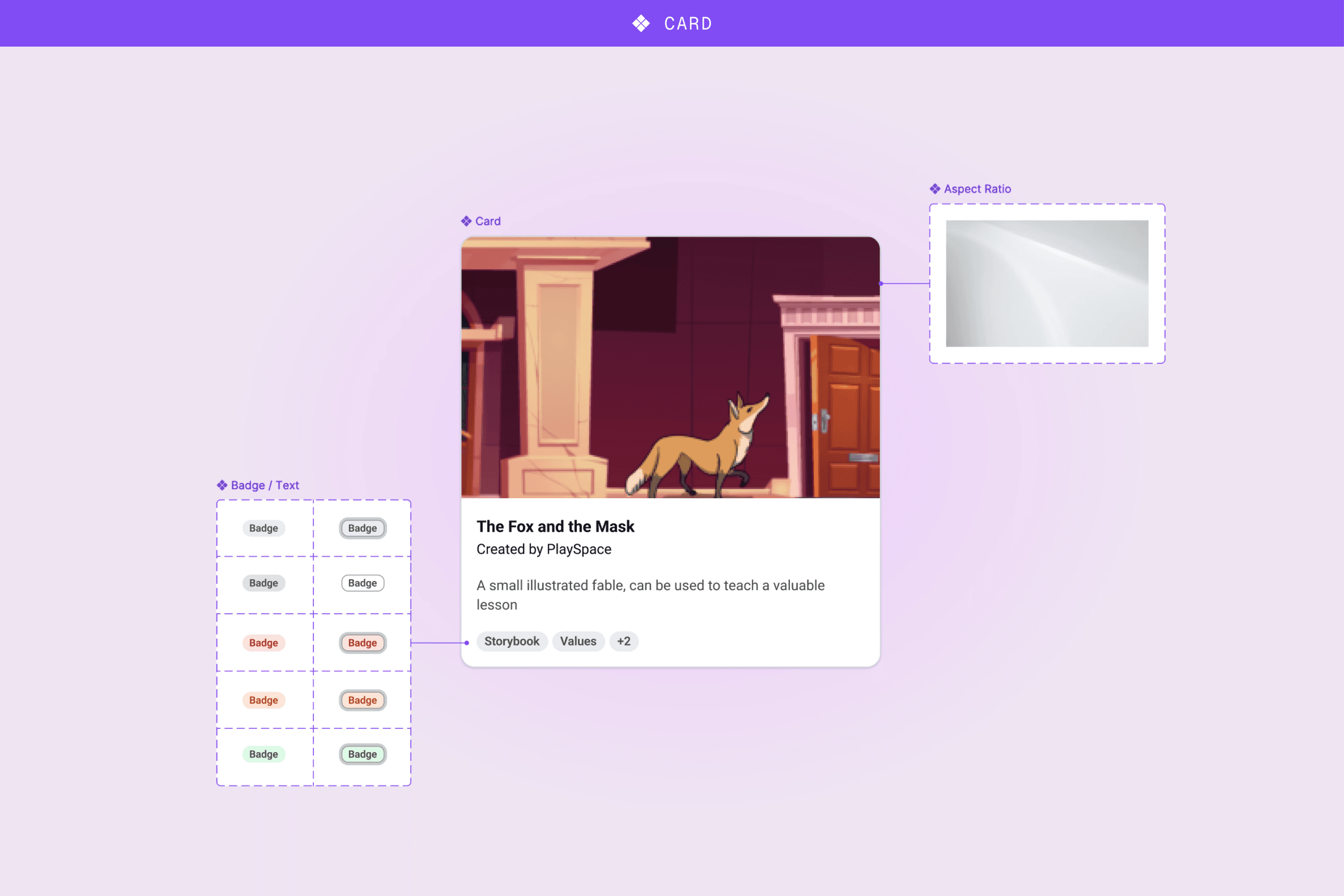
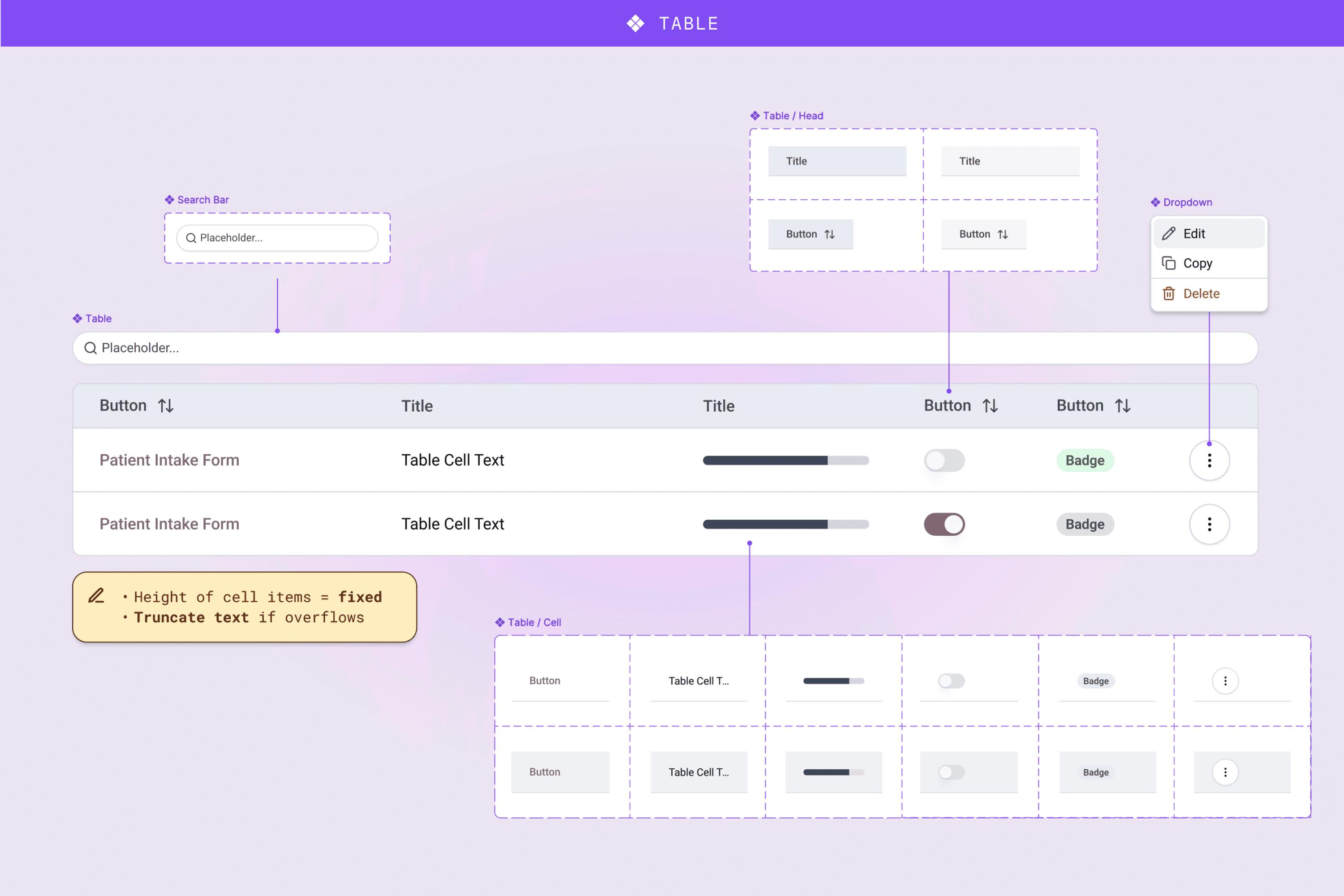
Components

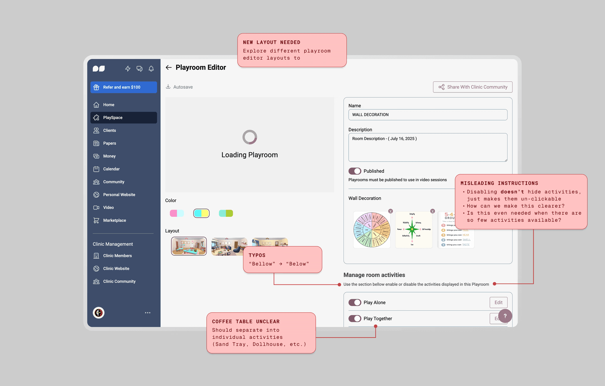
Example of practitioner feedback for the Playrooms overview & editor
I used UXPilot, Lovable and Figma Make to help visualize early concepts and prototype simple flows and interactions.
Final designs were refined in Figma and mapped back to components and variables before developer handoff to maintain quality and consistency.
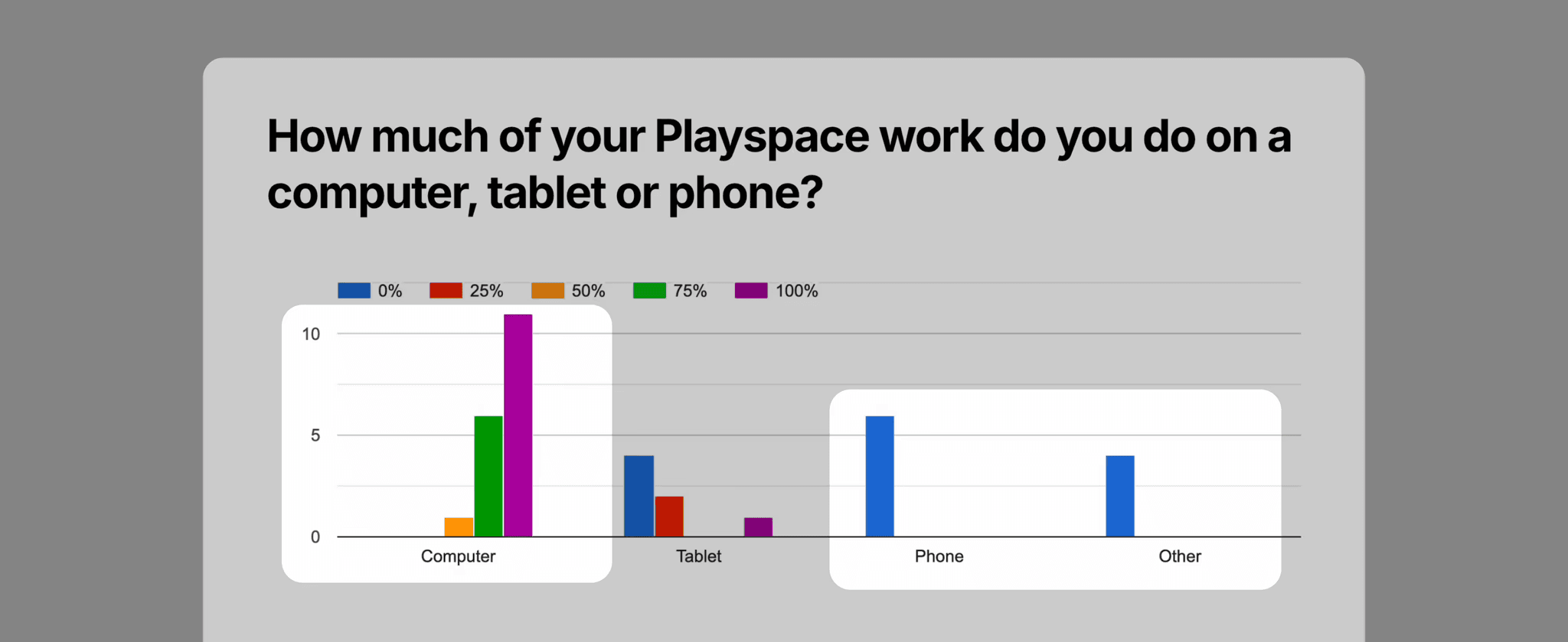
Based on customer surveys showing majority desktop/tablet usage, we deprioritized manual mobile designs. Instead, the dev team used AI to generate responsive layouts from my desktop designs, which proved effective enough given our tight timeline.


At the same time, I brought the developers together to align on the plan. I would modify the original tokens, adjust their application on components in order to match the updated visual direction, and simplify the overall component library so the developers could prioritize updates.
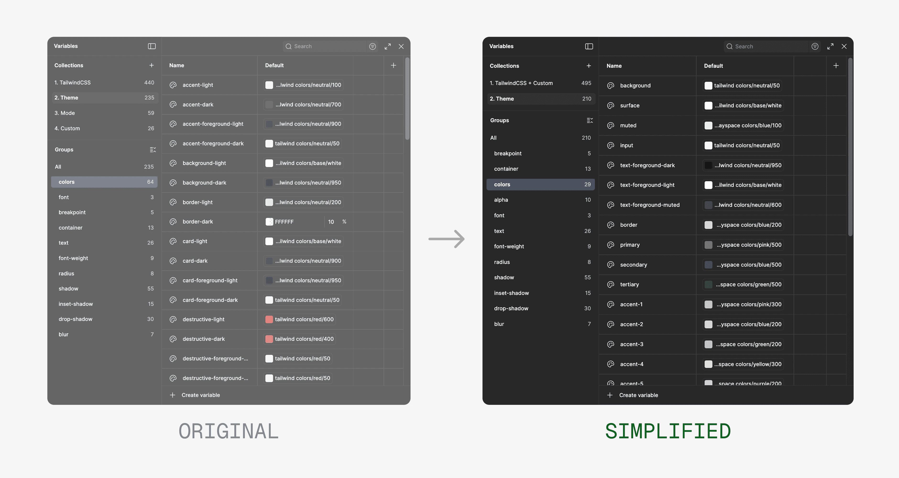
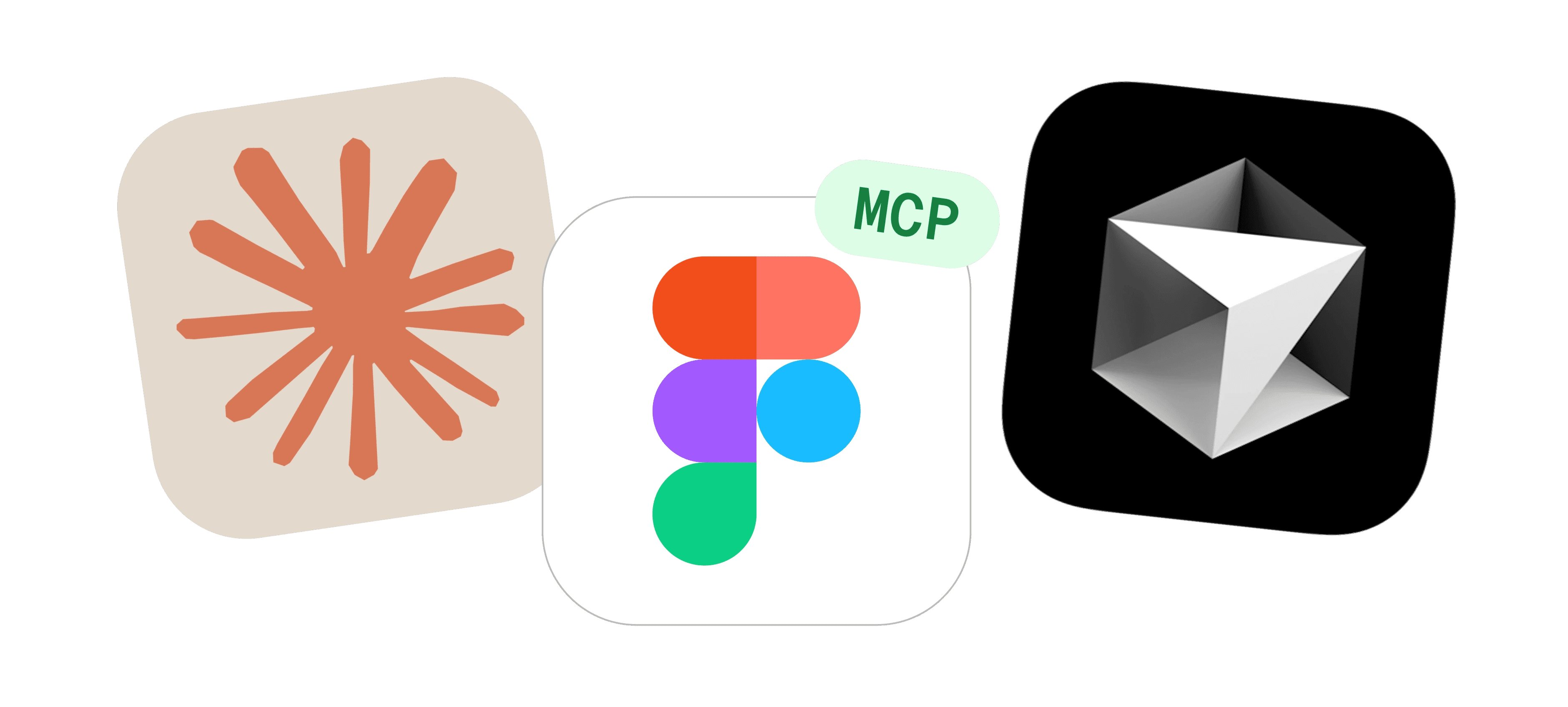
Once the master Figma file was finalized, the developers once again leveraged Figma MCP, Claude, and Cursor to update the customized components, variants and tokens one by one in the original codebase library. Here is where we landed with the finalized first version of the design system:
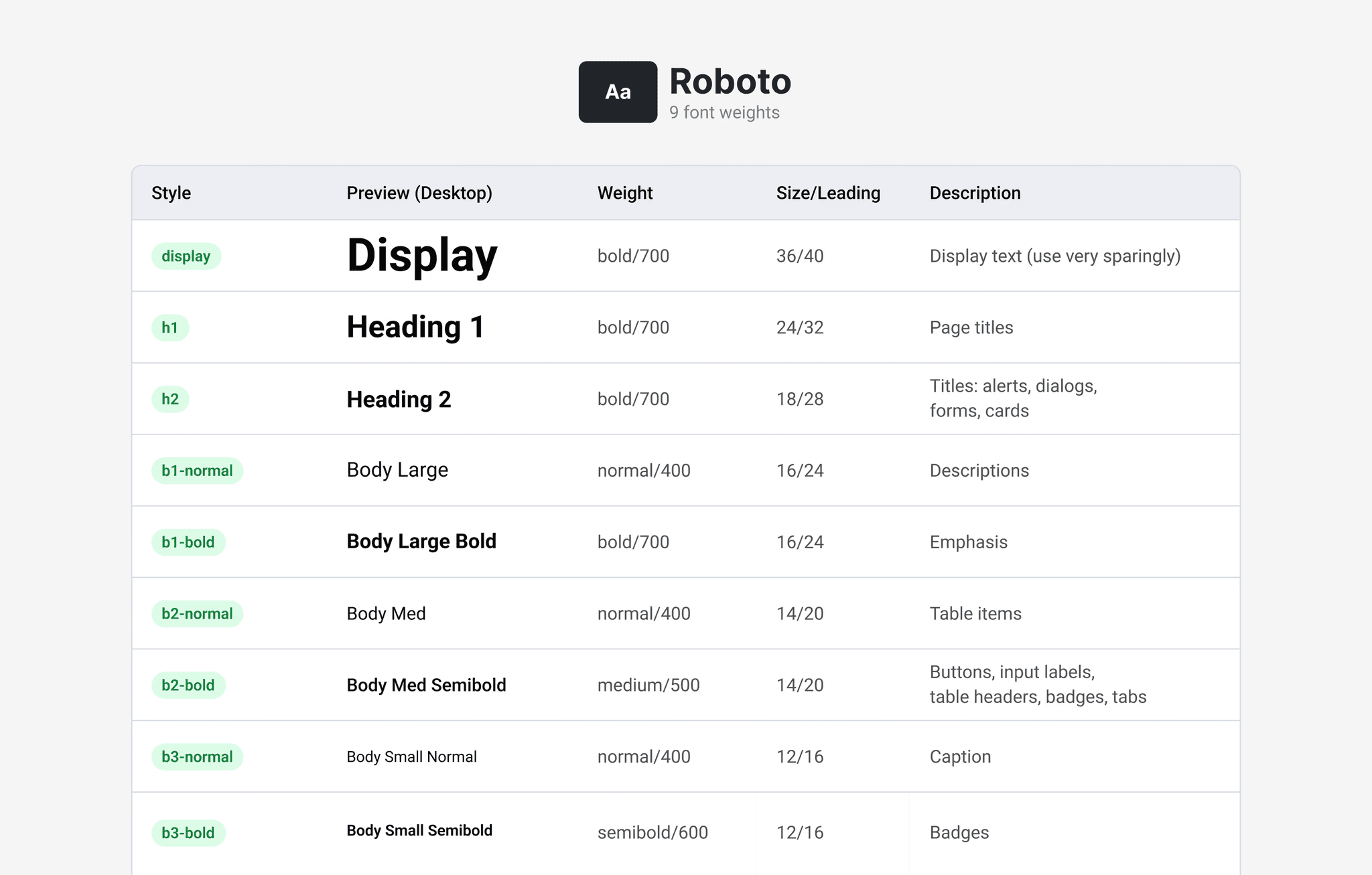
Typography styles with usage guidelines
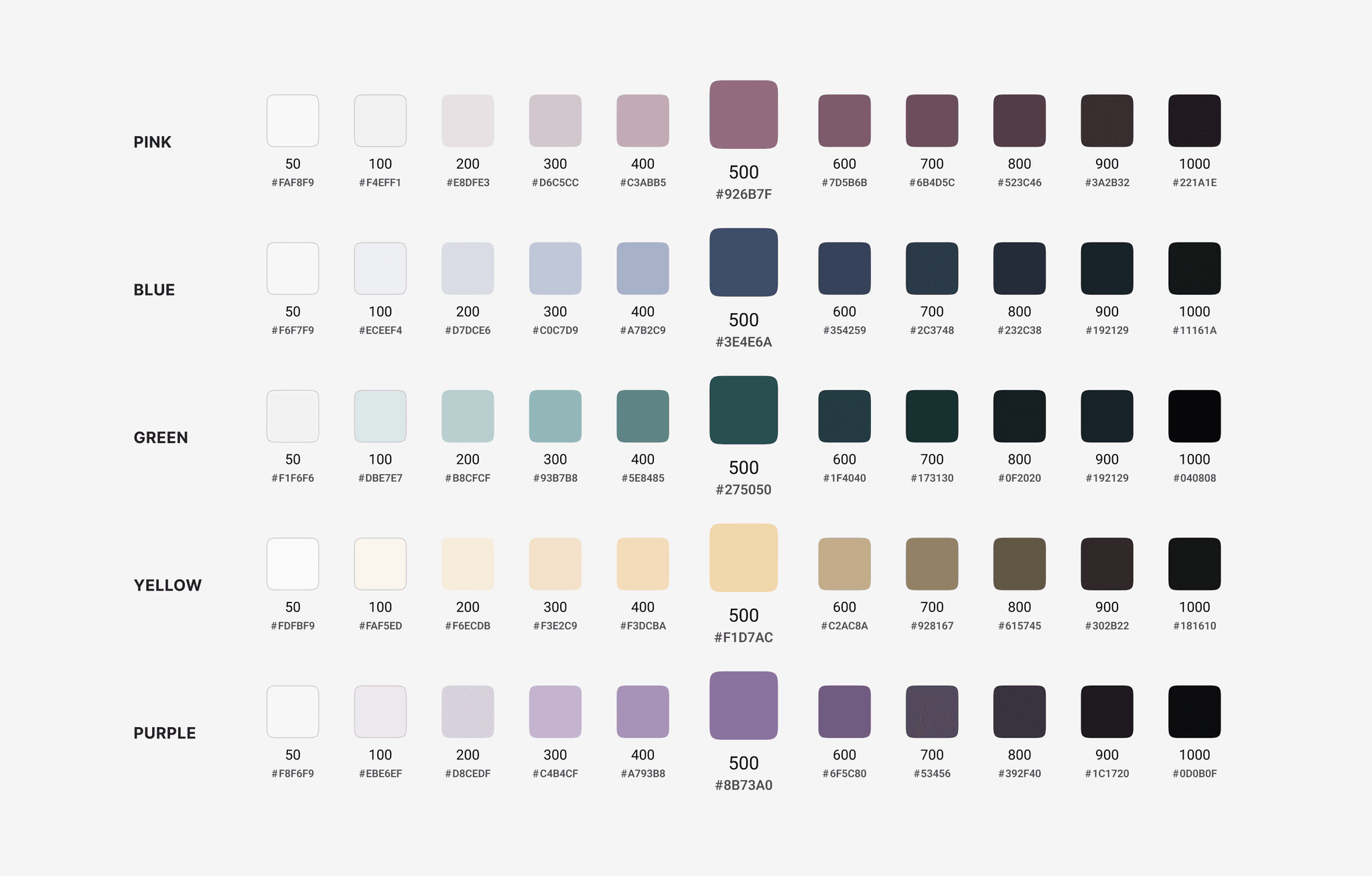
A complete colour ramp with functional and illustrative colour
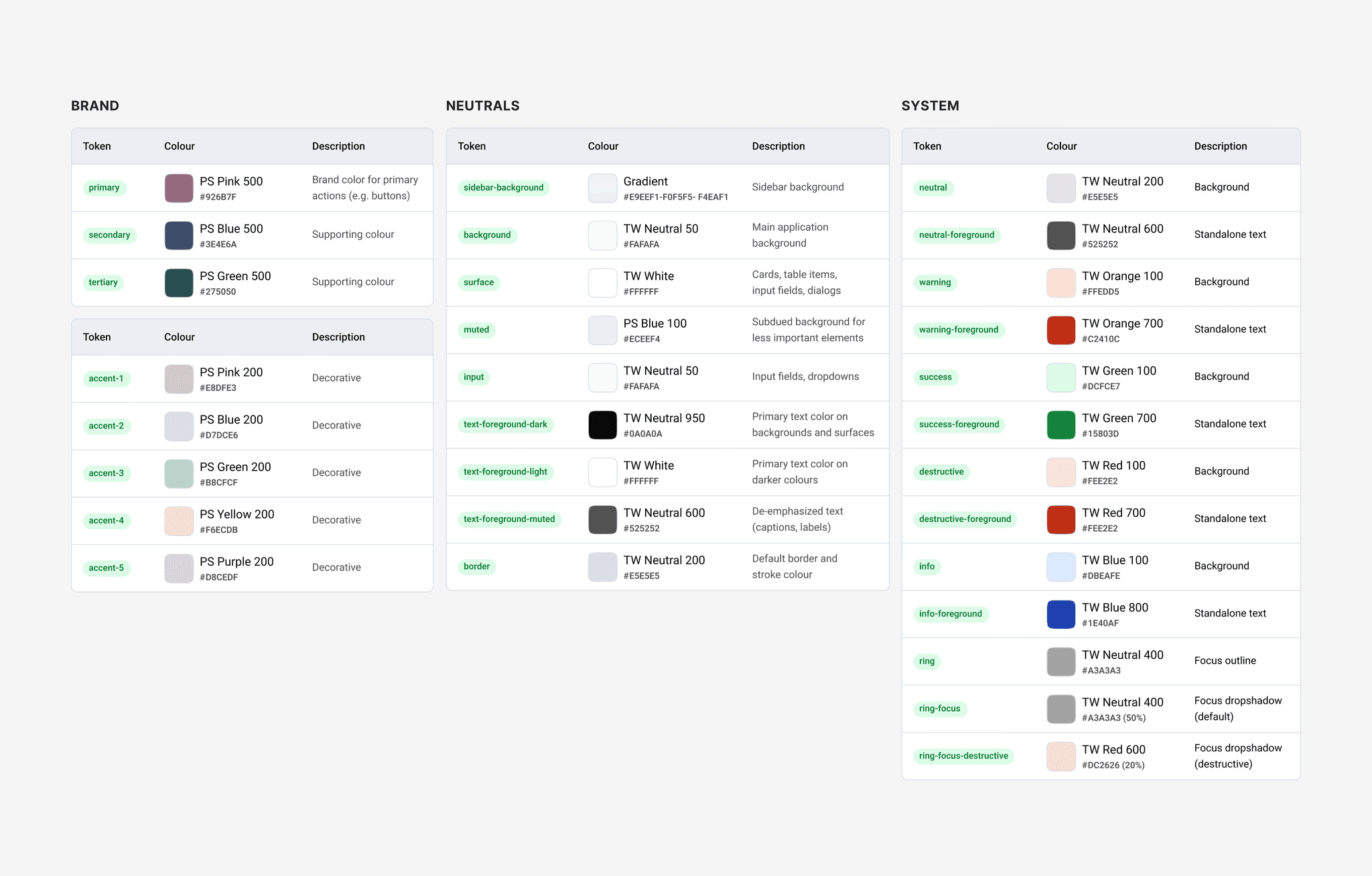
Colour tokens with descriptions
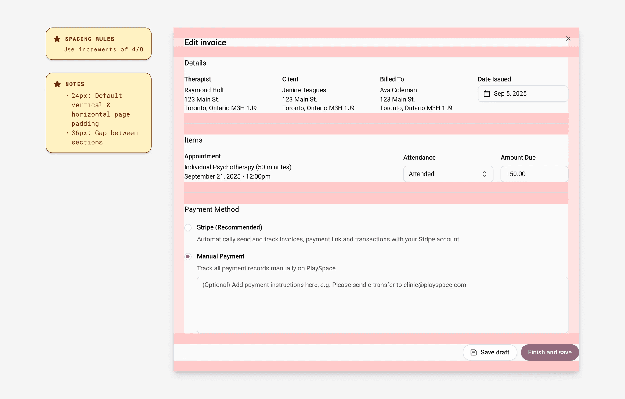
Spacing rules and examples